I am sooooo super excited to announce the new website design! When I started the blog back in the spring of 2010 at the suggestion of friends and family members, I figured I’d write a bit and see where it went. Well, it went places. Nearly 400 posts later, the blog was getting hard to navigate.
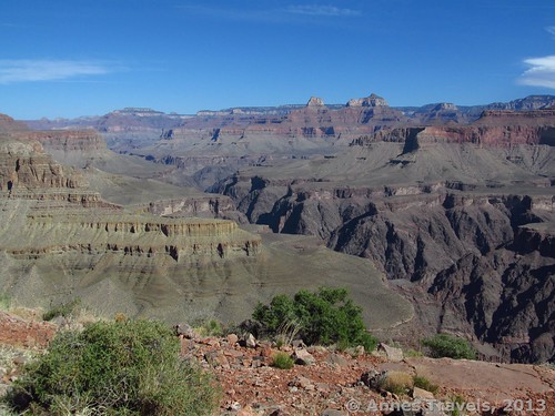
The Grand Canyon was an early favorite destination of ours. Here we view the canyon from Horseshoe Mesa.
Goodness, even I couldn’t find the stuff I wanted. How on earth was anyone else going to find anything besides the post they were currently reading?
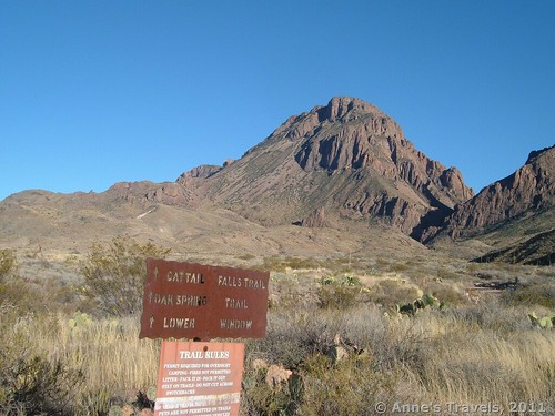
Posts like “Best Hikes in Big Bend National Park” aided with navigation, but not as much as I would like. This pic was snapped along the Oak Springs Trail.
I decided it was time for an upgrade.
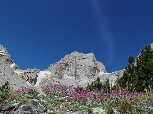
Hiking toward Middle Teton in Garnet Canyon, Grand Teton National Park, Wyoming
My web team got onto it, and this is the result! Navigation menus, better tags and categories for easier browsing, a new logo (shout-out to my favorite graphic artist!), and a new theme that’s a little more conservative and hiker-friendly.
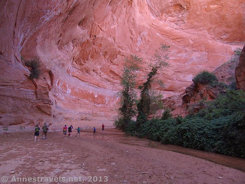
Coyote Gulch is one of my most-visited posts. Grand Staircase-Escalante National Monument, Utah.
My favorite update is the “states” link – you can literally click on a state and see every trail I’ve written about in that state! How cool is that? (Shout-out to my favorite web developer!)
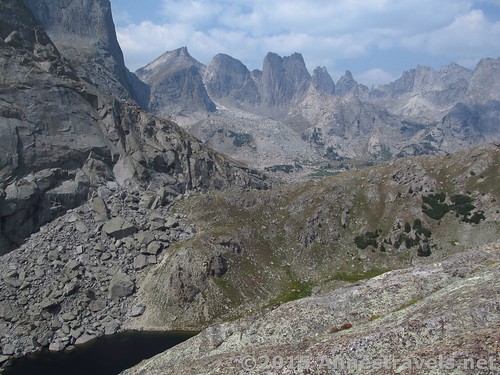
The Cirque of Towers was a favorite hike of mine in Wyoming (let alone the Wind Rivers) two summers ago
I found out a few things, too. Who knew that Wyoming is apparently my favorite state, with 58(!) posts, compared to my (apparent) second favorite states, Washington and Colorado, coming in at 43 posts each. I also found out that my favorite topic is apparently Views (who would have guessed? – lol), followed by Free (another “big” surprise).
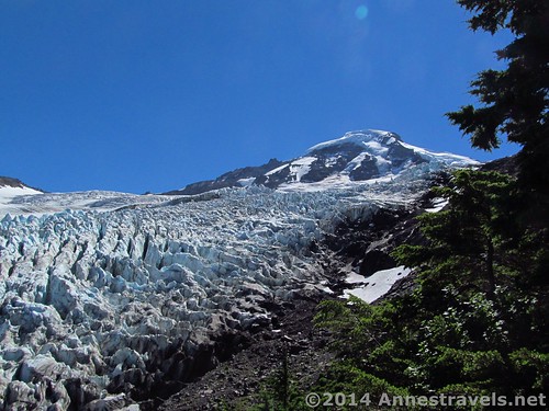
Apparently my favorite wilderness area is Mt. Baker-Snoqualmie National Forest (tagged 20 times). Who wouldn’t want to visit Heliotrope Glacier via four stream crossings and a treacherous rock slide?
I hope you like it as much as I do, and if there’s something you’d like to see, comment! You never know what might show up in the next few months 🙂
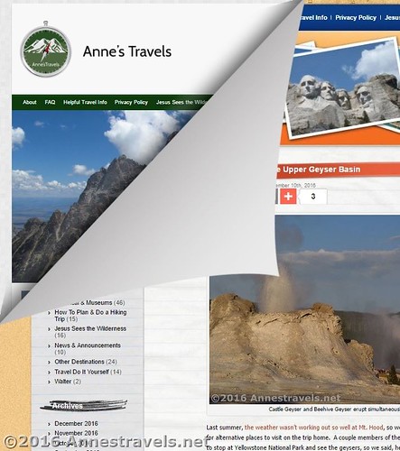
Anne, this looks great! I love how the white background really makes the photos stand out. And the state map is super helpful for searching posts. Nice update!
Thanks, Sara! I hope the site is a bit easier to navigate. Funny how we don’t believe when we start that these blogs can have so many posts after a few years!